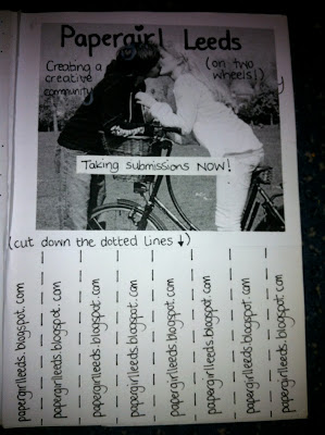
The final zine has less content than I initially planned. This was for three reasons.
- It was the first zine (of a few I hope) and was more like an introduction
- I was short of time in the end and underestimated the time it took to have handwritten text.
- The last few weeks of this project I have had migraine after migraine after migraine. Full days in bed followed by insomnia. As much as I work hard, it's pretty difficult to do quality work when in pain or sleep deprived. I'm hoping it's just a little stress and will go away once everything is handed in.
I used my bike illustration for the front cover. I'm very pleased with it! Went a bit mad with the hearts so possibly might scare off some boys (that exclaim they don't like all that icky girly hearty stuff - when I really think about it, why is a heart a girly thing, do boys not love?)
Hearts are a symbol of love and i feel this project is about love. End of.
American typewriter regular as a typeface. Keeping the handmade feel of everything. If only I had thought ahead and got an actual typewriter (what am I saying?? I'd still be typing right now!)
Basically this is a copy of what's on the facebook group and the blog. Most of the content is what I've already worked on weeks ago. Although I added the bit about 'most impulse and extraordinary ways for you to get your work into the world'. The Header of each page became questions, as if I was answering them in each topic.
I had problems printing some of the pages as the quality of the type was almost illegible in anything smaller than 10pt and I had lots of info. I chose to had write this page because. I felt that most people with initial interest would check out the facebook group further for more info. We are in the middle of an internet revolution.
I tried out different layouts for each page. I don't think that it worked everytime, but I was short on space and in all fairness it's a zine, there are no rules. I just had fun with it.
I should not draw bikes freehand when sleep deprived.
I tried to use elements of typography throughout the zine, differing sizes and boldness.
Leeds needs Papergirl.
The only map I have is a globe so there was no way I could trace it. I found an image of a world map and drew it freehand. Not too shabby really. I felt that it didn't stand out much on white paper so I cut it out and stuck it on black paper. Much better?
When it came to drawing the linking lines I had to use white lines over black and vice versa. I think this is still clear, I asked a few people and they understood too so that's good.
I was unsure of whether to keep this in the zine or not. Mainly because it's very dry reading material.
However, cycling through a major city is something I think a lot of people would be scared of and so I wanted to put their mind at rest just like I have on the facebook group.
Not sure whether to reference where the info came from.......
........it's a zine, who cares!
Not the most elaborate page but necessary.
I decided to keep the idea of the printables as I like the idea of people interacting and getting involved. I think I should make these downloadable from the blog too.
Does the f and the t mean facebook and twitter to you? I guess only if you use a computer.......hmmm
Now to print...............lots!


No comments:
Post a Comment